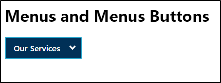
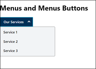
Menu & Menu Button

A menu button is a user interface component that is typically indicated using an icon or text that opens a menu when activated or clicked. It generally displays a list of options or actions that a user can choose from.
The menu button is often located at the top left or top right corner header section of a website or application. It is commonly used in mobile applications and websites to provide quick access to navigation menus or settings. It CAN also be defined within the main content area or the footer region. For example, language selection menu CAN be found in the footer section of the page as well.
The menu button helps users quickly navigate through different areas of the application or website.
NOTE:
- New to accessibility or uncertain of requirements, it will be helpful to review all sections below.
- Already familiar with requirements, skip to the “Working Example” section for sample HTML, CSS and JavaScript (when needed), along with a working demo.
Visual Identification (Menu Button)
- A downward or right pointing arrow SHOULD be used to indicate visually that it opens a menu.
- The arrow image SHOULD NOT be defined through CSS background-image property.
- There SHOULD be a clear visual focus indication provided for the menu button.
Color Requirements (Menu Button)
- The color contrast requirement of 3:1 ratio MUST be met with the adjacent color for down/right arrow icons.
-
The color contrast requirement of 4.5:1 ratio MUST be met with the adjacent color
for the menu button text for default, hover and focus states.
Note: If an image is used to identify the menu button (e.g., hamburger menu icon), then the color contrast requirement of 3:1 ratio MUST be met with the adjacent color for default, hover and focus states with the adjacent color. - The contrast requirement of 3:1 ratio MUST be met with the adjacent colors for the custom focus indicator of the menu button.
-
The down / right arrow icon denoting a menu button MUST be visible in High Contrast
Mode. However, they must be hidden from screen readers by using CSS content property and
aria-hidden="true"such that the image is not rendered across different platforms.
Menu Button Implementation
The menu button CAN be implemented using following approaches:
HTML
-
The triggering button that opens a menu when activated SHOULD be semantically
defined using native HTML <button> element.
- A descriptive and programmatic label MUST be provided for the menu button.
- If an image is used to identify the menu button, then a textual description MUST be defined for the image menu button.
-
If the image is defined using
<img>element, use an alt attribute with descriptive value. -
If the image is defined using
<svg>element, userole="img"and aria-label attribute to provide a role and an accessible name for the element.
Note: Providing ARIA based role and attribute on SVG image ensures robust support across different environments.
- The aria-expanded attribute MUST be provided for defining the expanded/collapsed state of the menu button.
-
The aria-controls attribute MUST be provided for
associating the menu button to its respective menu. It references the id attribute value defined for
the
<div>container containing the menu. - The aria-haspopup attribute MUST be provided for the menu button. Its value can be set to true or menu.
ARIA
Though ARIA CAN be used as an alternative, it is advisable to use correct semantic HTML element since native elements have built-in keyboard accessibility, roles and states.
-
The menu button SHOULD be defined using
role="button"for the parent neutral container such as<div>element. -
A
tabindex="0"attribute MUST be provided for the neutral container such as<div>element havingrole=”button”. - Appropriate JavaScript event handlers MUST be used to make the menu button accessible by keyboard and mouse.
- A descriptive and programmatic label MUST be provided for the menu button using aria-label attribute.
- The aria-expanded attribute MUST be provided for defining the expanded/collapsed state of the menu button.
-
The aria-controls attribute MUST be provided for
associating the menu button to its respective menu. It references the id attribute value defined for
the
<div>container containing the menu. - The aria-haspopup attribute MUST be provided for the menu button. Its value can be set to true or menu.
Focus Management (Menu Button)
Focus SHOULD be managed as follows:
- When focus is on the menu button, pressing Enter/Space SHOULD open the menu and places the focus on the first menuitem.
- Alternatively, Up/Down arrow keys CAN be also used to open the menu.
- Pressing Down arrow key opens the menu and places focus on the first menuitem.
- Pressing Up arrow key opens the menu and places focus on the last menuitem.
-
Focus management within the menu CAN be done using
element.focus()or using aria-activedescendant attribute. For more information, refer to Menu Button Example Using element.focus() and Managing Focus in Composites Using <span class="nw">aria-activedescendant</span> . - Pressing Escape key closes the expanded menu and focus moves to the menu button.

- A menu widget allows a user to navigate to a menuitem from the given list.
- It contains a list of menuitems that CAN display different submenus.
- A menu generally is triggered through a menu button.
- Generally, if a choice is activated, the menu is closed, and the action related to the selected choice is performed.
- The contrast requirement of 3:1 ratio MUST be met with the adjacent colors for the custom focus indicator of the menu options.
- The menuitem text MUST pass the minimum contrast ratio requirement of 4.5:1 against the background color by default and different states as well.
- Each menuitem MUST have a distinct visual focus indicator that passes the minimum color contrast ratio requirement of 3:1 against the background color.
Visual Identification (Menu)
- Indication of menu or a submenu MUST be visually denoted by a downward or right pointing arrow. This visual indication MUST be provided to the triggering element of the menu. For example, on a menu button to indicate that it opens a menu.
- There should be a clear visual indication of focus provided for the menuitems.
Color Requirements (Menu)
- The color contrast requirement of 4.5:1 ratio MUST be met with the adjacent color for the menuitem text for default, hover and focus states.
- The contrast requirement of 3:1 ratio MUST be met with the adjacent colors for the custom focus indicator of the menuitems.
Menu Implementation
The menu CAN be implemented as follows:
-
The parent
<ul>element containing the list of menu items or submenus MUST haverole="menu". -
Each of the
<li>element containing the submenus MUST haverole="none". -
Within each
<li>element, the menuitem MUST be defined using<a>element.
-
The
<a>element SHOULD be provided withrole="menuitem".
<a>element ensures that the menuitems receive focus and the href attribute value helps user to navigate to the targeted page. -
The
Focus Management (Menu)
Focus CAN be managed as follows:
- Focus SHOULD be wrapped within the menu.
- Roving tabindex mechanism SHOULD be implemented for navigating through the menuitems. For more information, refer to Managing Focus Within Components Using a Roving tabindex .
- When focus is on the first menuitem, pressing Enter SHOULD activate the menuitem which helps users in navigating to the targeted page.
- Pressing Down arrow key moves focus to the next menuitem.
-
Pressing Escape key closes the expanded menu. On closing the menu, the focus SHOULD
move to the triggering menu button.
For example,<!-- Defining the menu button --> <button id="productsBtn" aria-haspopup="true" aria-controls="productList">Our Services</button> <!-- Defining the menu that expands on the menu button --> <ul id="productList" role="menu" aria-labelledby="productsBtn"> <li role="none"><a href="#" role="menuitem">Service 1</a></li> <li role="none"><a href="#" tabindex="-1" role="menuitem">Service 2</a></li> <li role="none"><a href="#" tabindex="-1" role="menuitem">Service 3</a></li> </ul>
A well-defined menu and menu button benefits majorly the below users.
- People with cognitive disabilities
- People using speech input
- People with limited dexterity
- People using keyboard only
- People using screen readers
<button type="button" class="button" id="productsBtn" aria-haspopup="true" aria-controls="productList">
    Our Services
</button>
<ul class="dropdown-menu" id="productList" role="menu" aria-labelledby="productsBtn">
    <li role="none"><a href="#" tabindex="-1" role="menuitem">Service 1</a></li>
    <li role="none"><a href="#" tabindex="-1" role="menuitem">Service 2</a></li>
    <li role="none"><a href="#" tabindex="-1" role="menuitem">Service 3</a></li>
</ul>
button#productsBtn {
    padding: 0.6em 1em;
    border: 2px solid #25a7ce;
    font-size: 1em;
    border-radius: 2px;
    position: relative;
    width: 9.5em;
    text-align: left;
    font-weight: 600;
    background: #003057;
    color: #ffffff;
}

button#productsBtn::after {
    content: "";
    transform: rotate(45deg);
    -webkit-transform: rotate(45deg);
    border: solid #ffffff;
    border-width: 0 3px 3px 0;
    position: absolute;
    padding: 3px;
    top: 12px;
    right: 12px;
}

button#productsBtn[aria-expanded="true"]::after {
    content: "";
    transform: rotate(225deg);
    -webkit-transform: rotate(225deg);
    border: solid #ffffff;
    border-width: 0 3px 3px 0;
    display: inline-block;
    padding: 3px;
    top: 16px;
    right: 12px;
}

#productList {
    width: auto;
    height: auto;
    padding: 0;
    background-color: #F2F4F6;
    position: absolute;
    display: none;
    margin: 0;
    border: 1px solid #7C7C7C;
    list-style-type: none;
    border-radius: 3px;
    min-width: 250px;
}

#productList.active {
    display: block;
}

#productList li {
    line-height: 20px;
    font-weight: 600;
    padding: 0;
}

#productList li a {
    text-decoration: none;
    margin: 0.4em 0.5em;
    color: #000;
    padding: 0.5rem 0.5rem;
    border-radius: 4px;
    display: block;
}

#productList li a:focus, #productList li a:hover {
    color: #ffffff;
    outline: .15em solid #141B38;
    background-color: #0069c0;
}

button:focus {
  outline: .15em solid #141B38;
}
let toogleFlag = false;
let productBtn = document.getElementById('productsBtn');
let productList = document.getElementById('productList');
let allOptions = document.querySelectorAll('[role="none"]');
// let displayValue = getComputedStyle(productList);
let focusedItem = document.getElementById("option" + currentIndex);

productBtn.addEventListener('click', e => {
    if (toogleFlag) {
        closeMenu();
    } else {
        openMenu();
        document.querySelectorAll('#productList li a')[0].focus();
    }
});

let firstIndex = -1;
let currentIndex = 0;
let lastIndex = allOptions.length - 1;
productBtn.addEventListener('keydown', e => {
    if (e.keyCode === 13) {
        if (toogleFlag) {
            closeMenu();
        } else {
            openMenu();
        }
        document.querySelectorAll('#productList li a')[0].focus();
        currentIndex = 0;
        changeListPosition(currentIndex)
    }

    if (e.keyCode === 40) {
        openMenu();
      e.preventDefault();
        if (currentIndex >= lastIndex) {
            currentIndex = 0;
            changeListPosition(currentIndex)
        } else {
            currentIndex++;
            changeListPosition(currentIndex);
        }
    }
    if (e.keyCode === 38) {
        openMenu();
       e.preventDefault();
        if (currentIndex <= 0) {
            currentIndex = allOptions.length - 1;
            changeListPosition(currentIndex);
        } else {
            currentIndex--;
            changeListPosition(currentIndex);
        }
    }
    if (e.keyCode === 27) {
        currentIndex = -1;
        closeMenu();
    }
});

const openMenu = () => {
    productBtn.setAttribute("aria-expanded", true);
    productList.style.display = "block";
    toogleFlag = true;

}

const closeMenu = () => {
    productBtn.removeAttribute("aria-expanded");
    productList.style.display = "none";
    toogleFlag = false;
    productBtn.focus();
}

allOptions.forEach(option => {
    option.addEventListener('keydown', e => {
        if (e.keyCode === 40) {
            openMenu();
            if (currentIndex >= lastIndex) {
                currentIndex = 0;
                changeListPosition(currentIndex)
            } else {
                currentIndex++;
                changeListPosition(currentIndex);
            }
        }
        if (e.keyCode === 38) {
            openMenu();
            if (currentIndex <= 0) {
                currentIndex = allOptions.length - 1;
                changeListPosition(currentIndex);
            } else {
                currentIndex--;
                changeListPosition(currentIndex);
            }
        }
        if (e.keyCode === 27) {
            currentIndex = -1;
            closeMenu();
        }
    })
});

changeListPosition = (index) => {
    document.querySelectorAll('#productList li a')[index].focus();
    document.activeElement = allOptions[index];
}

window.addEventListener('mouseup', event => {
    if (event.target != productBtn && event.target.parentNode != productBtn) {
        productBtn.removeAttribute("aria-expanded");
            productList.style.display = "none";
            toogleFlag = false;
    }
);